Some of the most simple mistakes will undoubtedly lose your website
sales. What’s most unfortunate about these mistakes, is that you
probably had a guaranteed sale until you irritated or scared your
customer enough for them to find another store to shop at.
Mistake 1 (Old dates and information):

The internet is a very dynamic machine. When a visitor shows up on your website and sees your copyright date “Copyright © Anything < This Year” it instantly brings up questions. Are these prices still correct? Is this company even in business?
Unless your website has an enormous amount of perceived trust and you have a very strong brand (in which case your copyright date would most definitely be current), you will undoubtedly lose sales from this date alone.
The same thing goes for about us pages, and other information pages
that can be date specific. If your about us page states that you
specialize in computers with Windows 98, and Windows 2000 while Windows
Vista is the current release, it brings up questions to which there is
no good answer.
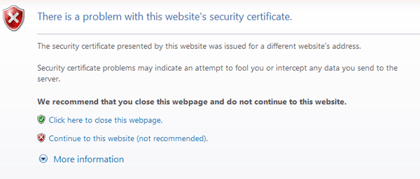
Mistake 2 (SSL related error messages):
I come across sites on a daily basis that serve up secure pages with
some problem in their SSL configuration. When you send a visitor to a
SSL protected page, there is a good reason for it. And, when an error
message precedes that secure connection, all confidence in your security
is lost. If you can’t figure out how to properly encrypt a website /
page / sub-domain without errors, you need to hire someone who can.

Also, to help prevent this from ever happening, make sure you do not
permanently install mis-configured ssl certificates. If you do get a ssl
error, make sure not to click the permanently allow this connection option.
Mistake 3 (Not showing payment and shipping options immediately):

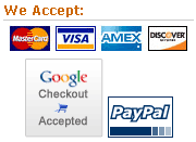
You should display your accepted payment methods on every page of your website! Don’t make your customer click on the about us, faq, or any other link to get this information. I’ve got securely hosted credit card logos here, if you need them.
You should display the shipping options and prices as soon as
technically possible, on the shopping cart page is best! Also, do not
make your user enter all of their shipping or billing information, (or worse yet, make them register)
before you give them shipping prices. Much of the time, your customer
won’t even consider filling out that much information just to get an
idea of how much shipping will cost.
Use a single zip field to calculate shipping and ask for the rest of their information further in the checkout process.
Mistake 4 (Improper add-to-cart functions):
With the Web 2.0 craze going on, it’s common to see spiffy Ajax and
dynamic add to cart functions where some small area of the website is
updated when an item is added to a shopping cart. This is not only a bad
idea, but it can be usability suicide.
While these actions may seem obvious to you, a lot of users don’t
notice a small box being updated, and it’s rarely what a shopper is
expecting to happen. It’s always best to redirect your user to a
shopping cart each time they add something to it. You can then provide a
return to last item / category / brand or whatever else link from the
shopping cart page as needed.
Mistake 5 (Poor internal search):
Google became popular because their search results were quick, and
highly relevant. Search function on your website is extremely important,
and should be quick and relevant. You need to be able to account for
things like misspellings and incomplete words. If you don’t have the
ability to implement a solid search function yourself, you should look
for a 3rd party application to use. If your website is well indexed,
Google offers a custom search engine that you can integrate into your website.
The only thing worse than showing bad search results is showing none at all.


